Pastels were last popular in interior design during the early 1990s, but over the following 20 years we watched them practically disappear from the color palette, as first neutral tones, and then bright and bold colors, permeated our homes.
Suddenly pastels are back with a vengeance, and homeowners are wondering how to integrate these soft, calming colors into their boldly decorated spaces around the home.
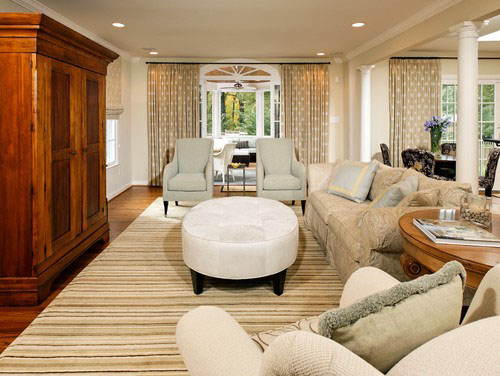
Pastel chairs and accent pillows add subtle color to a neutral space.
Interior decorating for spring is the perfect time to introduce pastels. Although trends in interior color schemes don’t always change with the seasons, interior color trends are much like seasonal changes that take place over longer periods of time. Consider the four seasons and the colors we typically associate with them:
- Spring – pastels and whites
- Summer – bright, bold colors
- Fall – earth tones and neutral colors
- Winter – dark colors, grays, and black
Interior color palettes are once again entering their spring, and this means a turn toward pastels in the home.
Pastel finishes add color that keeps a room light and bright.
Although pastels are contrary to the color schemes of yesterday, they have a lot to offer our homes if we’re willing to make room for them. Pastels have a soft spot on the color spectrum, giving them the ability to cushion a space by making it more welcoming, calming, and peaceful. In today’s fast-paced world, the home has become a place of order and retreat, and pastels offer a way to counter the busy world outside our living spaces.
How to decorate for spring with pastels.
How can we incorporate pastels into our home décor for spring, without doing a major remodel? Many people shy away from pastels because they run the risk of turning a home into a permanent Easter basket. In overabundance, pastels can quickly turn a space from serene to saccharine, but pairing a few new pastels with your existing color scheme can give a room a fresh look for spring without going overboard.
Choosing a pastel finish for one major item in an otherwise neutral space brings color into the room without dominating the scene.
If you’re into seasonal redecorating, consider a renovation that brings your space’s base colors and finishes back to neutral, and then plan to switch out some of the less permanent items seasonally—including accent pillows, blankets, artwork, smaller furniture, and décor—in order to maintain a fresh look that reflects changes in the natural world.
Pastels are the perfect decorations for spring.
Springtime is all about warming up for the year, and when it comes to pastels, even the colors on the cool end of the spectrum can be warming.
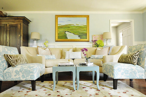
The blues are equally as warming as the yellows in this living room, while the accents in the painting and area rug help keep the space bright.
Pastels are naturally calming.
Instead of screaming for attention like many brighter colors can, pastels take a more subtle approach with tones that can be relaxing instead of overpowering. Inducing calmness and sleep may be the very reason pastels seem to dominate many nurseries.
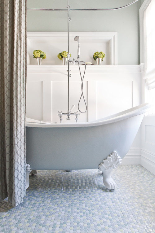
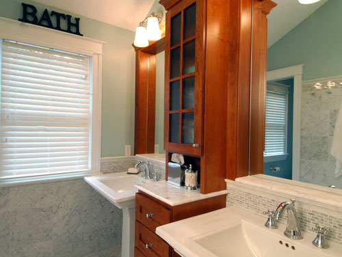
This baby blue bathtub and hexagon tile mosaic floor against the mint green return wall invite bathers to stay for awhile by contributing toward a relaxing atmosphere.
Integrate pastels through décor.
If large surfaces covered in pastel finishes will never be your thing, try adding a splash of soft color here and there with some pastel-colored accent pieces instead.
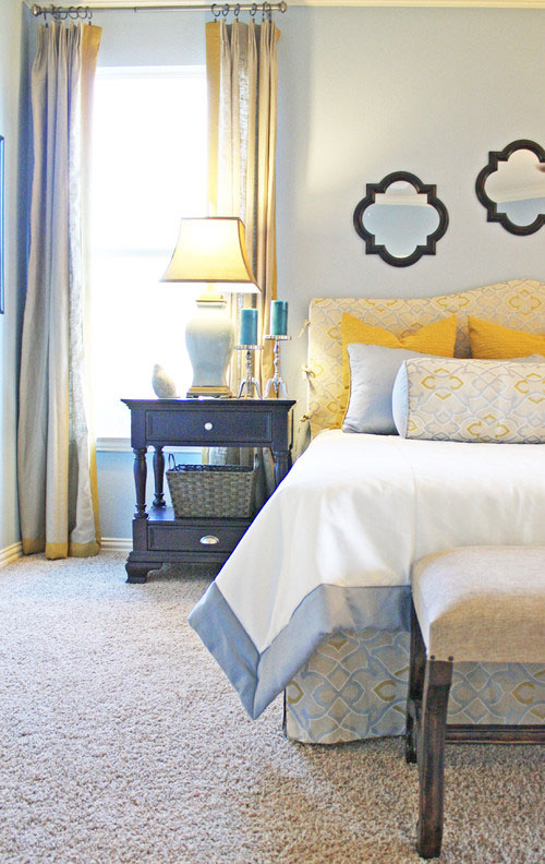
The accents in this room provide plenty of color while still keeping the room relatively neutral. When the owners of this space are ready for a new look, removing the accents will leave a completely neutral palette for a fresh look, despite the baby blue walls.
Pair softer pastels with brighter shades.
Pastels are created by adding white to a bolder color, so try integrating some tones that aren’t as “pastel” as others, to keep the edge on those softer colors.
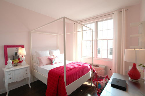
Pastel pink can be a tough color to crack, but this space uses it well as the calming backdrop for some hot pink accents.
Use varying shades of the same pastel.
Many spaces that successfully use pastels avoid the Easter basket look by sticking to just one or two pastels and using multiple shades of those colors.
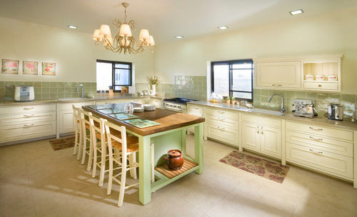
Light mint walls, the sage backsplash, and a spring green kitchen island work together to create a room that isn’t overtly green or pastel, even though the room’s finishes have a lot of both elements.
Pastels help warm up a cold or colorless space.
Pastels represent the lighter side of darker colors. Even gray in a pastel shade can bring a warming quality to a space.
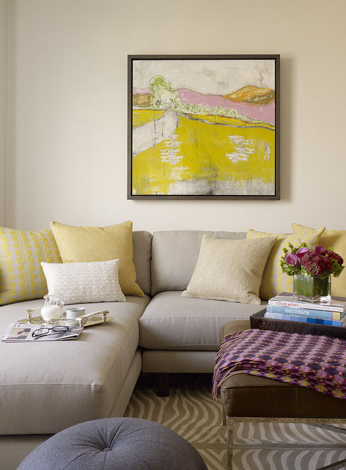
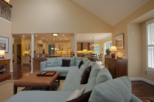
At a glance this room is really colorful, but take away the accent pillows, blanket, and bright painting and you have a very neutral, basic color scheme and framework for the space, making it extremely adaptable and easy to change up.
Pastels provide something different.
Pastels offer something that has been missing from other color trends: not too bright, too bold, or too cold, pastels light up a room while allowing us to relax and unwind at the same time.
Mint walls and pastel pink accent pillows are all this space needs to take it from stark white to bright and colorful.